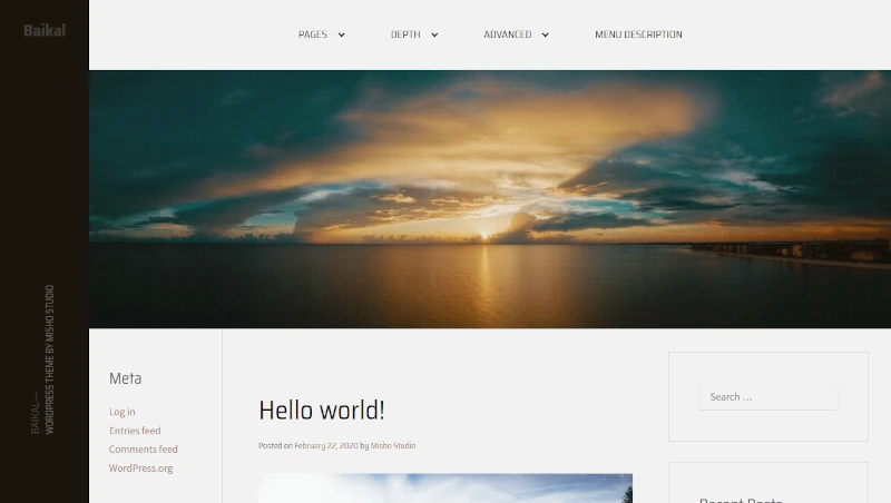
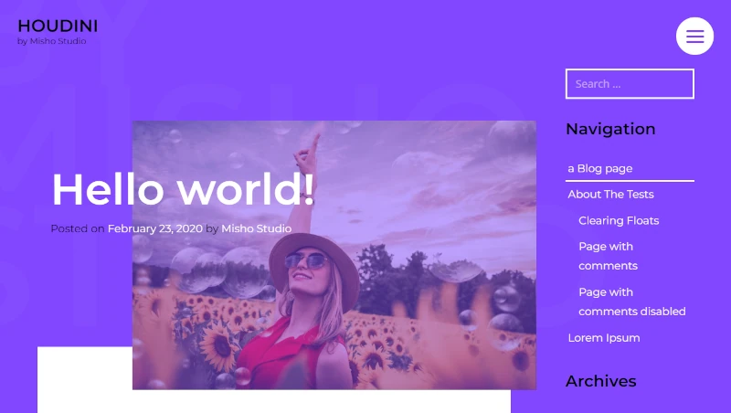
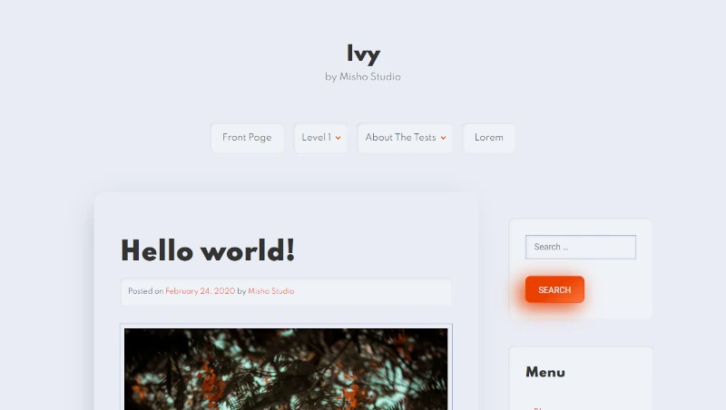
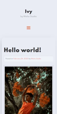
High performance WordPress themes
WordPress themes for every creator
We believe in lightweight themes that are easy to maintain and update over time. Designed to avoid as many hassle as possible.
Browse themes


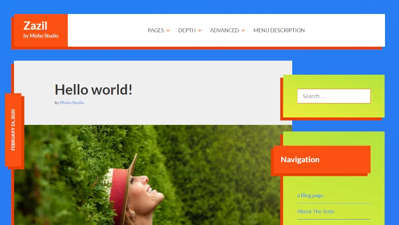
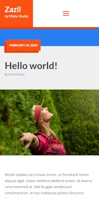
WordPress themes ready to launch
⇾
WordPress 6.x ready!
Our themes are already compatible with the latest major release of WordPress.
⇾
Code-free
Avoid complications. Set up your WordPress theme without writing a single line of code.
⇾
Customizable
Add your logo and colors to make your WordPress theme perfectly match your brand.
⇾
Responsive
Your WordPress theme will look amazing on all devices, regardless of screen resolution.
⇾
Report bugs
We’d love your feedback. Report any issues and help us make the themes even better.
⇾
Request themes
Request custom themes tailored to your projects and boost your productivity instantly.