Why should I use an elegant WordPress theme?
It all depends on the character you want to give to your project since each project has an audience and a particular language. There are projects for which having a very formal or sober appearance goes against what they intend to convey. However, there are other projects for which it is essential to maintain precisely these characteristics.
Analyze what message you want to send to your audience and which audience is to consume your content. Based on this analysis, you will be able to better select your WordPress theme.
What defines a WordPress theme to be elegant?
Simplicity. Elegance always goes hand in hand with simplicity. Therefore, in the design of elegant WordPress themes this rule also applies, an elegant design contains very well distributed elements, wide spaces, an absence of multiple colors, and a harmonious distribution at first glance.
What colors can I use in an elegant WordPress theme?
The recommended colors are those with low tones and, in general, colors that tend to be white or black. An elegant website should not contain high contrast colors distributed in multiple tones that break the feeling of harmony.
If you already have a brand defined for your project, it will be very easy for you to select the colors for your WordPress theme since these do not have to contrast with the colors that you currently have defined in your brand. Our elegant WordPress themes allow you to select all the colors you need to bring your projects to life, completely changing the look of the theme in seconds.
What is the importance of white space in the design of an elegant WordPress theme?
Although white space is essentially nothing, it plays a crucial role in designing elegant WordPress themes. The blank space gives meaning to the rest of the elements, allowing each one to interact with the rest harmoniously. So the white space should be enough to keep the layout from looking piled up but not dispersed. Too much white space can cause design elements to no longer be perceived as part of a whole and look like there were just randomly thrown.
Designing elegant WordPress themes is an arduous task because the designs not only have to look harmonious, they have to fulfill a goal, solve a problem, and make the users stay on your website as pleasant as possible.
What role does contrast play in an elegant WordPress theme?
You can play with high contrasts in the design of elegant WordPress themes, that is, you can choose two diametrically opposite colors and with them make compositions that will look harmonious, so high contrast is allowed, what you could not do is use multiple contrasting colors with each other, this breaks the harmony and turns a design that should look elegant into something that looks more quite vibrant, which is not bad, in itself, just that each project is different and therefore the design solutions also are.
Premium WordPress themes.
WordPress 6.x ready!
Our themes are already compatible with the latest major release of WordPress.
Code-free.
Avoid complications. Set up your WordPress theme without writing a single line of code.
Customizable.
Add your logo and colors to make your WordPress theme perfectly match your brand.
Responsive.
Your WordPress theme will look amazing on all devices, regardless of screen resolution.
Support 24/7.
Issues? We are ready to help and answer your questions in less than 24 hours.
Future updates.
Get one year or lifetime updates. Always be up to date with all WordPress major releases.
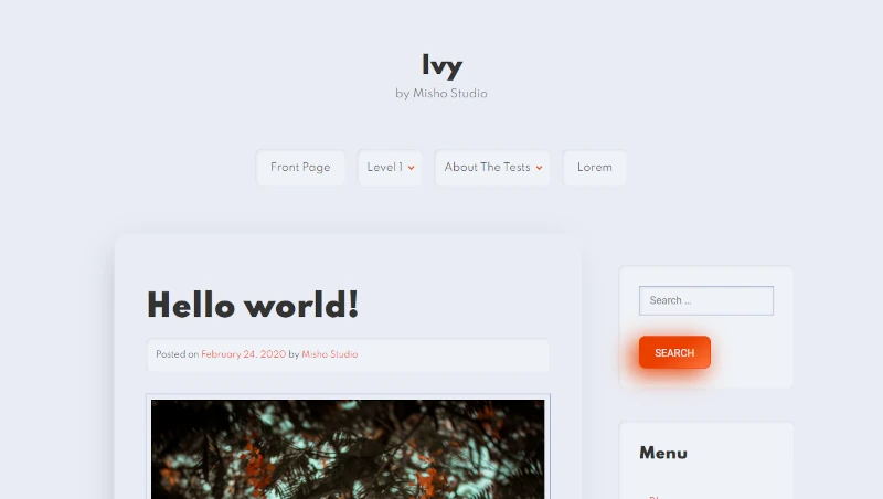
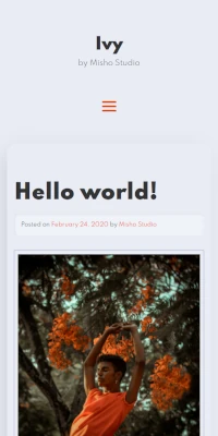
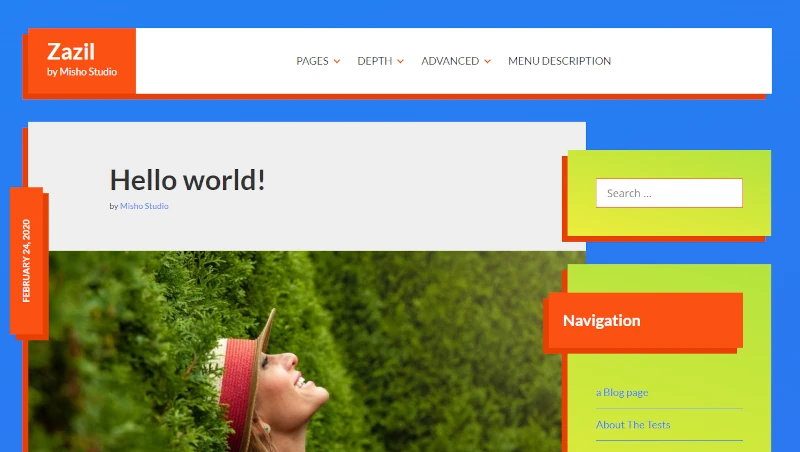
Ivy WordPress Theme.
This WordPress theme plays with shadows to create the feeling of volume and depth. Includes a little splash of color too. Perfect for projects that seek to transmit modernity and peace.
